Thursday, 26 March 2015

Oil Printing Workshop


I then took part in an oil printing workshop and thought that this was one of my favourites.  I got told about the different techniques and methods that are used when using oils these include:
Intaglio print - etching
Relief 
Mono-printing
Embossing
Photopolymer - intaglio 

The first method we tried was a simple text poster using the metal letters and a thin layer of ink.  This was quite fun because we had to lay out the letters backwards so they would appear the correct way when we turned the paper around.  The magnets are very strong and hard to move but we used them so that the letters would stay in place when we pulled the roller over it.  We used rollers and a very thin layer of ink on the letters and made sure that it was even, then we carefully places some paper over it and two other thick pieces so that there would be more pressure when rolling over it.  The first couple of prints weren't too great as some of the paint was patchy so we tried it again with another thin layer of paint and made sure it was more evenly spread the next time around.  After testing out this technique we tried some prints using a giant press machine, I really liked how these ones turned out, again we put a thin layer of ink onto a small transparent screen and layed out some fabrics.  Then I layed it out on the machine and out some tracing paper over it then the large fabric and turned the wheel.  When I took the fabric off of the screen there was a perfect print of it in the ink and after that I put the fabric with ink on and put it on a separate piece of paper and it printed it pattern of the fabric.  
Even though I really enjoyed the workshop I do not think there are many ways I could incorporate it into my images.


Bottom image is the printed version


Screen Printing Workshop

Screen Printing - "A technique that uses a woven mesh to support an ink blocking stencil to receive a desired image.  The stencil forms open areas so that the ink is able to pass through revealing the image."

Another workshop I took part in was for screen printing,  this workshop was very beneficial to me because this could be a technique that I use when it comes to printing my pictures, as a way to make them larger, which will contrast with the fact that they are macro shots.  Screen printing you also have to use a negative of something and then use the lightbox to transfer the picture onto the screen.  I found this workshop required a lot more preparation than when I did the cyanotypes, but the results from screen printing are a lot clearer rather than patchy areas of blue around the picture, with this method you are able to control the colours and the intensity of the image by using the squeegee.  The screens I used are silk-screens and using these is like a stencil method.  The whole of the screen is covered with emulsion and then the negative image is transferred on, so the the ink/acrylic paint (which we mixed with a gel to make it not as thick) is then pushed through the holes. One colour must be done at a time.


Silk screen


Monday, 16 March 2015

Cyanotype Workshop


Cyanotype is a printing process that produces a cyan-blue print using two chemicals - Ferric Ammonium Citrate and Potassium Ferricyanide.

I took part in a cyanotype workshop which I really enjoyed.  I took a few negatives on acetate with me and one positive so I could have one where I could compare which one worked the best.  
I liked this printing technique because I like how you are bale to control the texture of the background to either completely covered in the chemicals or where there are some areas left un-painted as well as some brush marks, leaving them white which leaves a nice comparison between the dark blue.  I think the cyanotypes that worked the best are the ones that were exposed to the ultraviolet light for 200 light units, because I feel that 400 light units was a bit too dark when we washed off the chemicals.  I think that I could use this method when I begin to print my images because the gaps in the paint and chemicals will add to the texture of the skin.


Thursday, 12 March 2015

Bibliography

First draft of my bibliography:


book on edmodo about photography??


Tuesday, 3 March 2015

Edited images


I believe that these images best describe the direction that I want to take my project so I chose to edit them.  For the one with the arms I used the greyscale and changed it into a simple monochrome, which better displays the textures and patterns of the skin and because the backdrop is black and there is little light , the contrast of the light skin stands out well.  The bottom image I kept as colour and just changed the saturation and shadows and I like the way it turned out as the colours are a lot brighter and slightly over exposed and I think this makes it look a bit like a polaroid. 


Pictures - The human form


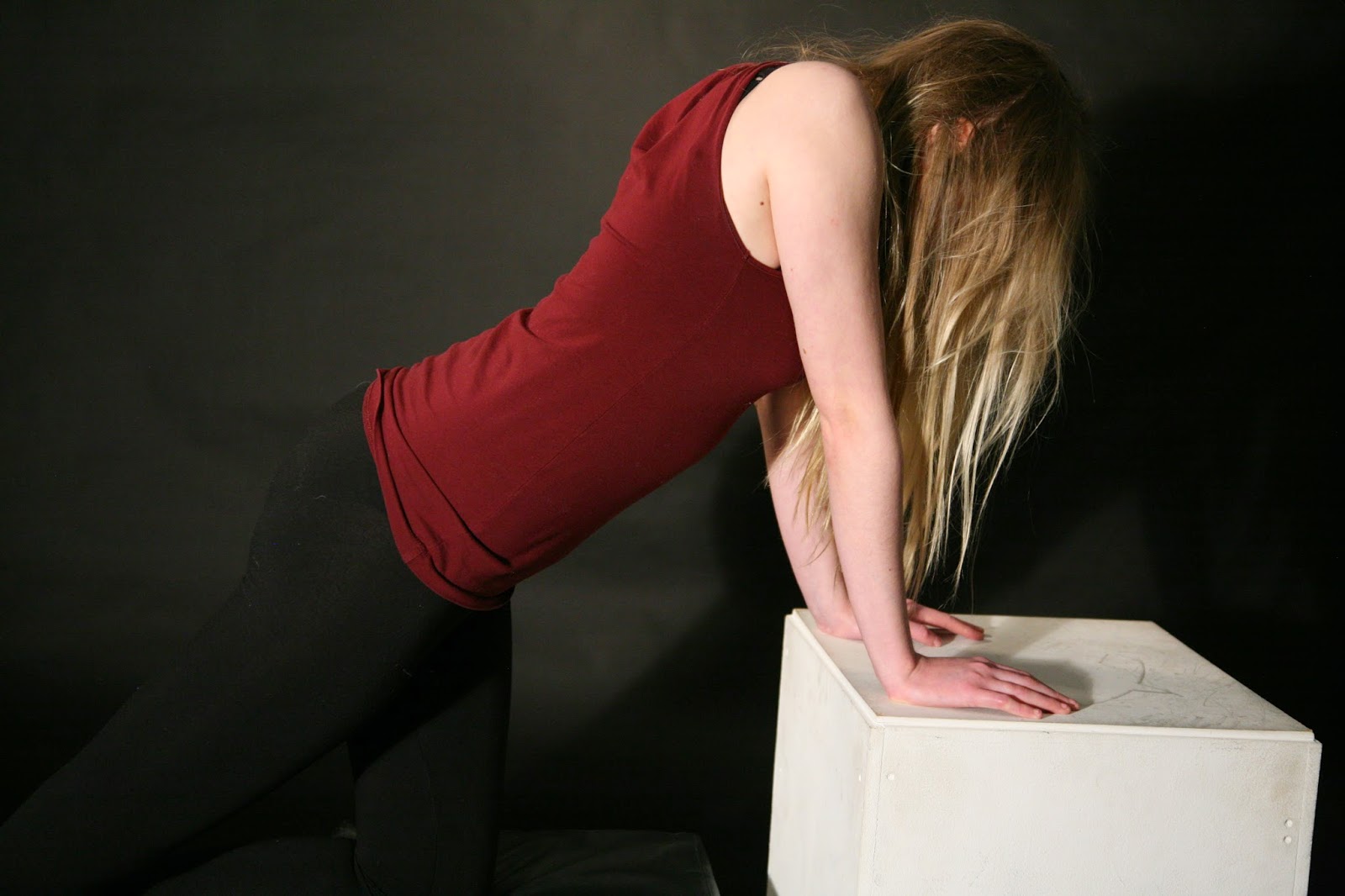
  I chose to keep the background for my pictures black so the focus of the background wouldn't be drawn away the body.  For the lighting I tested out how effective just basic 3-point lighting would be against the background and how it would bounce and reflect off the body.  I think keeping the lighting quite basic worked better than I expected because I was able to control the brightness of each light so I could keep the colour of the background rather than it being a bit washed out and appear more grey. I kept the backlight on all of the time compared to the key light which I decided to turn off in some of the images which I like because the backlight outlines the body and adds shadow to the side and front.  The fill light I controlled by turning down the brightness and think it looked best when not on full brightness.
Firstly I decided to capture just simple portrait shots facing different ways and angles, then began to take full body shots to show more of the form of the body and how I can manipulate it into a multitude of shapes.  Secondly I thought I'd take some closer pictures of the skin and arms, showing the textures of the skin.  I thought some of the close ups worked well because the light skin contrasted with the dark backdrop however the closer I wanted to get to the skin the blurrier the camera would go, and so to capture this better I should use a macro lens.
From these images I believe I was able to portray the form of the body rather well, from the variety of poses.  However In comparison to the closer images of the arms I think they turned out a lot better than the full body shots because the model is clothed the form is not all that well to see.  Macro photography and textures of the skin I will look further into. 


Books


 I looked at a couple of books for some inspiration and techniques for my polariods and portraits as full body shots/shadows. 

Better Picture Guide to Portrait photography - David Wilson

The polariod book - Taschen


Monday, 2 March 2015

Scratching polariods


After taking my polariods and looking at Lucas Samaras' distorted polariods I thought that it would be a good idea to test out scratching my images.  I cut along the bottom edge of the polariod which allowed me to peel away the back layer of film.  I then used a scalpel and scratched onto the surface then turned it around to see what it looked like on the front.  Then I though of using just a simple black permanent marker and drew over the indentations I had made using the scalpel, I like the effect this gave because it gave the picture back some colour and depth rather than just see through sections.    I tried to smudge the ink itself but was unsuccessful as I think you need to do it as soon as the picture has developed.  At first I didn't think that this technique would work because I didn't think you could open up the polariods, but after having a go I quite like the end result and how it looks a bit more scruffy, I think I will try this out on some of my better polariods.